Scrum Burn Down Charts: Complete Guide 2026
 Scrum Burn Down Charts - Complete Guide
A burndown chart is a graphical representation of the work remaining to be done versus time.
It is commonly used in Agile project management and Scrum methodologies to track the progress of a project, sprint, or iteration.
The chart has two axes: the vertical axis represents the amount of work remaining (measured in story points or tasks) and the horizontal axis represents time (in days or sprints).
As work is completed, the chart shows a downward trend. Ideally, by the end of the sprint, the chart reaches zero - meaning all planned work is done.
Quick Answer: Burn Down Charts at a Glance
| Aspect | Sprint Burndown | Release Burndown |
|---|---|---|
| Time Horizon | One sprint (1-4 weeks) | Multiple sprints (full release) |
| X-Axis | Days in the sprint | Sprint numbers |
| Y-Axis | Story points or hours remaining | Story points remaining |
| Updated | Daily | Per sprint |
| Best For | Sprint-level progress tracking | Release forecasting |
| Who Reviews It | Scrum Team daily | Team + stakeholders per sprint |
Table Of Contents-
- What is a Burn Down Chart?
- How Burn Down Charts Work
- Utilizing Burndown Charts in Scrum Projects
- How to Improve Agile Project Management with Burn Down Charts
- How to Assess Progress or Risks Using Burn Down Charts
- Common Burn Down Chart Patterns and What They Mean
- Crafting Your Burndown Chart
- Using Burn Down Charts Effectively
- Limitations of Burndown Charts
- Burn Up vs. Burn Down Charts
- Common Burn Down Chart Mistakes
- Industry-Specific Burndown Examples
- Burn Down Chart Maturity Model
- Tools for Burn Down Charts
- Conclusion
- Quiz on Scrum Burn Down Charts
- Frequently Asked Questions
What is a Burn Down Chart?
 What is a Burn Down Chart?
A Burndown Chart is a visual representation that tracks the progress of tasks, be it within an epic or a sprint.
It showcases the amount of work that has been completed and the work that remains.
Its significance goes beyond aesthetics - it is a predictive compass for your team's journey, gauging the likelihood of completing tasks within the allocated time.
It provides a visual way for Scrum Teams to track their progress towards the Sprint Goal, making it easier to identify potential issues, risks, or delays and take corrective action as needed.
In the realm of agile projects, Burndown Charts come in two main types: Product Burndown Charts and Sprint Burndown Charts.
Product Burndown Charts
Product Burndown Charts provide a holistic view of the entire project.
These charts offer a snapshot of how many product goals your team has accomplished and the remaining work.
Instead of traditional dates, the horizontal axis represents sprint numbers, while the vertical axis displays story points.
When to use a Product Burndown Chart:
- Tracking progress toward a product release across multiple sprints
- Communicating overall project health to stakeholders
- Forecasting release dates based on current velocity
- Identifying scope changes that affect the overall release timeline
Sprint Burndown Charts
Sprint Burndown Charts zoom in on ongoing sprints.
They showcase user stories selected during sprint planning and employ days on the horizontal axis to gauge performance.
Many teams adopt a blend of both Product and Sprint Burndown Charts, fostering transparency and ensuring everyone is informed about the team's progress.
When to use a Sprint Burndown Chart:
- Tracking daily progress within a sprint
- Identifying if the team is on track to meet the Sprint Goal
- Detecting scope creep or unexpected work additions during a sprint
- Informing the Daily Scrum discussion
How Burn Down Charts Work
A Burn Down Chart typically has two axes:
- Horizontal Axis: Represents the time available in the Sprint, usually divided into days.
- Vertical Axis: Represents the amount of work remaining in the Sprint, usually measured in effort units, such as Story Points or task hours.
As the Development Team completes tasks within the Sprint, the remaining work decreases, and the Burn Down Chart shows a downward trend.
The ideal burn-down line slopes downward from the total work at the beginning of the Sprint to zero work at the end of the Sprint.
By comparing the actual burn-down line to the ideal burn-down line, the Scrum Team can assess their progress and make adjustments as needed to stay on track towards the Sprint Goal.
The ideal burn-down line is a straight diagonal from total story points on Day 1 to zero on the final day. Reality never follows this exactly - what matters is the overall trend.
Utilizing Burndown Charts in Scrum Projects
Before you can read a Burndown Chart effectively, grasp what information it encapsulates. A basic Burndown Chart provides the following data:
- Total Work at Each Iteration: Insights into the workload at different points in time or iterations.
- Remaining Tasks: An overview of tasks that are yet to be completed.
- Actual Speed of the Team: The real pace at which your team is progressing.
- Estimated Speed of the Team: Predicted performance based on past data.
In certain cases, Burndown Charts also function as guardians against scope creep, allowing managers to ensure projects stay on course.
How to Improve Agile Project Management with Burn Down Charts
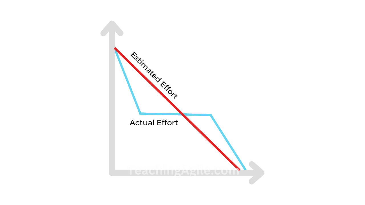 Actual vs Estimated in a Burn Down Chart
A burn-down chart can improve agile project management in several ways:
-
Performance Monitoring: Teams can monitor their performance throughout a sprint or iteration, ensuring they are on track to meet their goals.
-
Issue Identification: Deviations from the ideal trendline highlight issues such as scope changes, resource constraints, or technical challenges that need to be addressed promptly.
-
Scope Management: By tracking work remaining, teams can manage the project scope effectively. If there is too much work remaining towards the end of a sprint, the team and stakeholders can discuss scope adjustments.
-
Predictability: Burn-down charts help in predicting whether the team will complete the planned work within the sprint. This enables better planning and expectation management.
-
Motivation: Team members are motivated by seeing progress on the chart, which can lead to increased productivity and commitment to achieving sprint goals.
How to Assess Progress or Risks Using Burn Down Charts
Burndown Charts offer profound insights into team dynamics. Here are the key signals to watch:
Early Completion: If your team consistently wraps up tasks ahead of schedule, it could indicate they are undercommitting during sprint planning.
Consistent Misses: If your team repeatedly falls short of their projections, they may be overcommitting or underestimating complexity.
Sharp Drops: A sudden, sharp decline in the Burndown Chart during a sprint could signify inaccurate estimations or inadequately decomposed tasks.
Flat Lines: No downward progress for multiple days signals a blocker. Investigate immediately.
Upward Spikes: The chart goes up when new work is added mid-sprint (scope creep) or when re-estimation reveals more work than initially thought.
Common Burn Down Chart Patterns and What They Mean
Recognizing patterns in burndown charts helps diagnose team and process health:
The Ideal Diagonal
The actual line closely follows the ideal line. This indicates accurate estimation and steady execution. Strive for this but do not treat it as an absolute requirement - minor deviations are normal.
The Cliff
Work stays flat for most of the sprint, then drops sharply near the end. This signals a waterfall-like behavior where work is only finished at the last minute. Teams are likely not integrating and testing continuously.
The Sawtooth
The chart zigzags up and down repeatedly. This typically means work is being re-estimated mid-sprint, scope is changing frequently, or tasks are being marked done before they truly meet the Definition of Done.
The Flat Line
Almost no progress for days. Usually indicates a blocker (technical dependency, waiting on approvals, unclear requirements) that the Scrum Master should address immediately.
The Upward Slope
The chart trends upward instead of down. Scope is being added faster than work is being completed. This is a clear sign of scope creep or a significantly underestimated sprint.
Completed Early (Under-committed)
The chart reaches zero with several days to spare, every sprint. The team is consistently undercommitting - sprint planning needs adjustment to pull in more work.
Crafting Your Burndown Chart
Now that we have explored the nuances of burndown charts, here is how you can create one:
Step 1. Estimate Effort
Begin by estimating the effort required to complete a given sprint.
This estimation should align with your ideal baseline - the desired timeframe for sprint completion.
For instance, if your ideal baseline entails finishing a sprint in 5 days with 80 hours of work, you would commence with 80 hours on your effort trajectory and track daily progress accordingly.
Step 2. Track Daily Progress
Track daily progress by recording the time it takes to complete each task and monitoring how the effort aligns with your goal.
A simple chart or timeline tool can facilitate this process.
Step 3. Compute the Actual Effort
While your initial estimates serve as a benchmark, record the actual effort required for each task.
This may vary due to project complexities or unforeseen challenges, resulting in a non-linear actual work line on your burndown chart.
Step 4. Obtain the Final Dataset
Gather data from your initial effort estimates and actual work logs.
Keeping this data accessible to team members throughout the project is advisable.
Step 5. Plot the Burndown
Finally, plot your datasets on the burndown chart.
The Y-axis should reflect your estimated effort, while the X-axis spans from the project's start to its completion.
This visual representation will showcase both your ideal remaining time and the actual progress.
Using Burn Down Charts Effectively
To effectively use Burn Down Charts, follow these best practices:
-
Update the Chart Daily: Ensure the Development Team updates the Burn Down Chart daily, reflecting the accurate amount of remaining work. This helps maintain a clear, up-to-date picture of the team's progress.
-
Communicate Progress: Share the Burn Down Chart with the entire Scrum Team and relevant stakeholders to promote transparency and facilitate communication about the team's progress towards the Sprint Goal.
-
Identify Issues and Risks: Use the Burn Down Chart to identify potential issues, risks, or delays, such as deviations from the ideal burn-down line or sudden increases in remaining work. Address these concerns promptly.
-
Adapt and Adjust: If the Burn Down Chart indicates the Scrum Team is not on track, consider adapting the team's approach or adjusting the Sprint scope to better align with available time and resources.
-
Review and Learn: After each Sprint, review the Burn Down Chart to identify areas of improvement and incorporate these learnings into future Sprints.
-
Do Not Use as a Performance Weapon: The chart is a transparency tool, not a way to pressure the team. Treating it as a management control device destroys psychological safety and undermines Scrum values.
Limitations of Burndown Charts
While burndown charts are valuable, they have limitations:
-
Limited Scope Visibility: They only show completed story points or tasks, omitting changes in the project's scope.
-
Estimation Reliance: The accuracy of the ideal work line depends on initial time estimates. Overestimation may make progress appear on track, while underestimation can signal false delays.
-
No Quality Signal: A chart reaching zero does not mean work meets the Definition of Done at an acceptable quality level. Teams could rush work just to "burn down" the chart.
-
No Blocker Context: A flat line shows something is wrong but does not explain why. Additional communication is always needed.
-
Not Comparable Across Teams: Burndown charts from different teams cannot be meaningfully compared because story point scales differ.
Burn Up vs. Burn Down Charts
While Burndown Charts are a staple in agile project management, it is essential to know their counterpart - Burn Up Charts.
 What is a Burn-Up Chart?
Burn Up Charts share the same coordinate system as Burndown Charts but serve a different purpose.
| Aspect | Burn Down Chart | Burn Up Chart |
|---|---|---|
| Direction | Starts high, trends to zero | Starts at zero, trends up |
| Shows | Work remaining | Work completed |
| Scope Changes | Hard to see (chart jumps up) | Clearly visible (scope line shifts) |
| Best For | Sprint progress, team-facing | Release planning, stakeholder-facing |
| Simplicity | Simpler to read at a glance | More context, slightly more complex |
Burn Up Charts focus on showcasing progress and how much you have achieved rather than the remaining work. They start from the bottom and ascend, with a scope line indicating the project's total requirements. Aligning the progress line with the scope line by the project's end signifies success.
When to choose Burn Up over Burn Down:
- When scope changes frequently and stakeholders need to see the impact
- For release planning conversations with business stakeholders
- When the team wants to celebrate completed work rather than focus on what is left
Common Burn Down Chart Mistakes
Mistake 1: Not Updating Daily
Problem: The chart is updated only at the end of the sprint, making it useless for daily course corrections.
Why It's Problematic: Teams cannot identify early warning signs or adjust course.
Fix: Make chart updates part of the Daily Scrum routine. Each developer updates their remaining work estimate daily, not just when tasks are "done."
Mistake 2: Counting Partially Complete Work
Problem: Teams count a story as 50% done and remove half its points from the burndown.
Why It's Problematic: Partial credit violates the Definition of Done and gives a false sense of progress. Work is either done or not done.
Fix: Only remove story points from the burndown when a story fully meets the Definition of Done.
Mistake 3: Using the Chart as a Management Pressure Tool
Problem: Managers use flat or upward burndowns to pressure teams in a negative way.
Why It's Problematic: Teams game the chart (marking things done that are not done) to avoid criticism.
Fix: Frame the chart as a team transparency tool. Use deviations as conversations starters, not performance reviews.
Mistake 4: Ignoring Mid-Sprint Scope Additions
Problem: New work is added mid-sprint without adjusting the scope line or having a negotiation conversation.
Why It's Problematic: The sprint becomes unachievable and the burndown misleads the team.
Fix: Any mid-sprint scope addition should be explicitly negotiated with the Product Owner. If accepted, the total on the Y-axis should increase visibly.
Mistake 5: Treating Estimation Units Inconsistently
Problem: Some team members track hours, others track story points, and some do not update at all.
Why It's Problematic: The chart becomes inaccurate and meaningless.
Fix: Agree on one unit of measurement at the start of each sprint and use it consistently.
Mistake 6: Comparing Charts Across Teams
Problem: Management compares burndown velocity across different teams.
Why It's Problematic: Different teams have different story point scales, team sizes, and sprint contexts.
Fix: Use burndown charts within a team to track trends over time, never as a cross-team comparison metric.
Mistake 7: Creating the Chart Without the Team
Problem: A Scrum Master or project manager creates the ideal line without the team's input.
Why It's Problematic: If the team does not own the estimates, they do not own the chart or the commitments.
Fix: The team creates the burndown together during Sprint Planning, agreeing on the total work and the ideal trajectory.
Mistake 8: Ignoring Patterns Over Multiple Sprints
Problem: Each sprint's burndown is reviewed in isolation.
Why It's Problematic: Recurring patterns (e.g., always finishing late, always finishing early) signal systemic issues that are missed.
Fix: Review burndown trends across 5-10 sprints during retrospectives to identify systemic process improvements.
Industry-Specific Burndown Examples
SaaS/Cloud Services
Sprint burndown focus areas:
- API endpoint completion with integration tests
- Feature flags toggled off until full testing complete
- Deployment pipeline stages as separate burndown items
- Security scan completion tracked as a mandatory task
- Documentation updates included in Definition of Done
Healthcare Software
Sprint burndown considerations:
- HIPAA compliance review tasks explicitly tracked
- PHI handling verification as non-negotiable sprint items
- Audit logging implementation tracked per feature
- Clinical workflow validation steps included in estimates
- Sign-off from clinical stakeholders tracked as sprint tasks
Financial Services
Sprint burndown focus areas:
- Regulatory compliance checks as explicit tasks
- Fraud detection algorithm testing included in story estimates
- PCI-DSS requirement verification tasks tracked
- Performance benchmarks (transaction speed) as acceptance criteria
- Security penetration testing items tracked in release burndown
E-commerce
Sprint burndown considerations:
- Payment gateway integration tests tracked as sprint items
- Cart abandonment flow validation included in estimates
- Performance testing (page load under load) as sprint tasks
- Mobile responsiveness verification included in Definition of Done
- A/B test setup and validation tracked as separate stories
Mobile Apps
Sprint burndown focus areas:
- App store guideline compliance checks as sprint tasks
- Device compatibility testing across iOS/Android versions
- Offline mode behavior testing tracked explicitly
- Battery and memory usage benchmarks as acceptance criteria
- Push notification delivery testing included in stories
Enterprise DevOps
Sprint burndown considerations:
- Infrastructure as Code changes tracked alongside feature work
- Security scanning (SAST/DAST) integrated into sprint tasks
- Rollback procedure documentation as a sprint deliverable
- Cross-team dependency resolution tracked on release burndown
- Monitoring and alerting setup included in Definition of Done
Burn Down Chart Maturity Model
Stage 1: Basic Tracking (Sprints 1-6)
Characteristics:
- Chart updated manually (spreadsheet or whiteboard)
- Updated end-of-day or every other day
- Only tracks task completion (binary: done/not done)
- Team still learning estimation
What a Stage 1 burndown looks like:
- Irregular update frequency
- Large steps (days without movement, then big drops)
- Often ends above zero or reaches zero significantly early
Improvement focus: Establish daily update habit and agree on what "done" means.
Stage 2: Consistent Practice (Sprints 7-15)
Characteristics:
- Chart updated daily by the team
- Story points used consistently
- Patterns are visible and discussed in retrospectives
- Team understands what deviations mean
What a Stage 2 burndown looks like:
- More consistent daily drops
- Scope additions are visible and discussed
- Team reviews burndown during Daily Scrum
Improvement focus: Use pattern recognition to improve estimation accuracy.
Stage 3: Predictive Mastery (Sprint 16+)
Characteristics:
- Burndown integrated into tool (Jira, Azure DevOps, etc.)
- Team uses burndown to forecast completion proactively
- Both sprint and release burndowns maintained
- Burndown data informs sprint planning for future sprints
What a Stage 3 burndown looks like:
- Actual line closely follows ideal most sprints
- Deviations trigger constructive conversations, not blame
- Burndown trends used to continuously improve velocity and estimation
Improvement focus: Use release burndown for stakeholder communication and long-term forecasting.
Tools for Burn Down Charts
| Tool | Type | Burndown Support | Best For |
|---|---|---|---|
| Jira | Full ALM | Automatic sprint + release burndowns | Enterprise teams |
| Azure DevOps | Full ALM | Automatic sprint burndowns | Microsoft ecosystem |
| Linear | Issue tracker | Automatic cycle burndowns | Product teams |
| Trello | Kanban board | Via plugins (e.g., Plus for Trello) | Small teams |
| GitHub Projects | Issue tracker | Limited, via third-party | Open-source teams |
| Excel/Google Sheets | Spreadsheet | Manual but fully customizable | Any team |
| Miro | Whiteboard | Manual drawing | Co-located or workshop use |
⚠️
Avoid spending more time maintaining the burndown chart than doing actual work. If chart maintenance takes more than 5 minutes per day, simplify your tracking approach.
Conclusion
Burn Down Charts are a powerful Scrum metric and reporting tool that help Scrum Teams monitor their progress during a Sprint and identify potential issues, risks, or delays.
By effectively using Burn Down Charts and following best practices, your Scrum Team can optimize its performance and stay on track towards achieving the Sprint Goal.
Key takeaways:
- Use sprint burndowns for daily team transparency, release burndowns for stakeholder communication
- Recognize patterns (cliff, sawtooth, flat line) and act on them in retrospectives
- Never count partial credit - only fully Done work burns down
- Treat the chart as a team transparency tool, not a management control instrument
- Progress through the maturity model: basic tracking to consistent practice to predictive mastery
Quiz on Scrum Burn Down Charts
Your Score: 0/15
Question: What is the primary purpose of a Burn Down Chart in Scrum?
Continue Reading
Sprint Velocity: How to Calculate and Use ItLearn how sprint velocity complements burn down charts to give your team a complete picture of progress and capacity.
Cumulative Flow Diagrams: Visualize Work in ProgressDiscover how CFDs offer a flow-based alternative to burn down charts for identifying bottlenecks and improving predictability.
Sprint Planning: Your Guide to Effective Scrum ExecutionMaster sprint planning to set the starting point of your burn down chart with accurate estimates and a realistic sprint goal.
Sprint Retrospective: Boost Team PerformanceUse burn down chart patterns from past sprints as data to drive more focused and effective retrospective conversations.
Definition of Done: The Complete GuideUnderstand why only work meeting the Definition of Done should burn down on your sprint chart.
Daily Scrum: Guide to Running Effective Daily StandupsLearn how the Daily Scrum is the right time to review the burn down chart and discuss deviations from the ideal line.
Sprint Backlog: Essential Guide for Scrum TeamsExplore how the Sprint Backlog drives what gets tracked on your burn down chart during each sprint.
Continuous Integration - Boost Scrum DevelopmentSee how CI/CD practices can automate burn down updates by triggering completion when code is deployed and tested.
Frequently Asked Questions (FAQs) / People Also Ask (PAA)
How does a Burn Down Chart differ from a Gantt chart?
Can Burn Down Charts be used effectively with Kanban teams?
How many sprints of data do you need before a Burn Down Chart becomes predictive?
Should remote or distributed Scrum teams use Burn Down Charts differently?
How does scope creep appear on a Burn Down Chart and how should teams respond?
What is the relationship between Burn Down Charts and Sprint Velocity?
How should a team handle a burn down chart that reaches zero before the sprint ends?
Is a Burn Down Chart a required artifact in Scrum?
How do Burn Down Charts support Sprint Retrospective conversations?
Can a Burn Down Chart work without story points - for example using task count or hours?
How do large teams or teams of teams use Burn Down Charts?
What psychological impact do Burn Down Charts have on team morale?
How often should the Scrum Master review the Burn Down Chart and what actions should they take?
How do Burn Down Charts integrate with modern DevOps and CI/CD practices?
What is the difference between tracking 'tasks remaining' versus 'story points remaining' on a burndown chart?